






ShiftCart Design System

v0.1 preview. Every value below comes from tokens/*.json through scripts/build-tokens.mjs — nothing here is hand-written CSS, so this page cannot drift from the tokens. 247 tokens, two authored themes, 96 audited colour pairings.

Dark green is the action colour

#003d29 fills the one CTA per screen the user cannot undo. 12.36:1.

Green is a state, plus the repeated action

#108910 means fresh, in stock, delivered — and fills the ADD button pressed forty times a screen.

Yellow is a fill, never a mark

#ffdc23 is 1.33:1 on white. It carries offers and never renders text, an icon, or a focus ring.

Borders divide, elevation separates

The page is white and cards carry no border — elevation lifts them off it. Borders now do one job: dividing things inside a surface.

Inventory

Generated from inventory.json, and the build fails if any component here has no markup in the page. Completeness is checked mechanically, not eyeballed — a checklist that can drift from the thing it checks is decoration.

Atoms
ButtonIcon ButtonLinkTextHeadingIconBadgeStatus DotAvatarDividerSpinnerSkeletonCheckboxRadioSwitchToggle ButtonText InputText AreaNumber InputSelectSliderKbdCodeProgress Bar
Molecules
FieldButton GroupToggle Button GroupSegmented ControlAvatar GroupBreadcrumbsPaginationTab ListAccordionCardClickable CardSelectable CardAlertBannerToastTooltipPopoverHover CardDropdown MenuMore MenuSearch InputStepperEmpty StateChipDate InputTimestampMetadata List
Organisms
App ShellTop NavSide NavSide DrawerBottom SheetDialogCommand PaletteTableData TableListTree ListToolbarCarouselDate PickerFile UploadCombobox
Layout primitives
StackGridSectionContainerAspect RatioResize Handle
ShiftCart domain
Product TileQuantity StepperPriceDelivery Slot PickerOffer Badge
Gradients
Gradient HeroGradient BandGradient Card
Illustration
Empty CartNo OrdersNo ResultsNot ServiceablePayment FailedTier Reference
Composed pages
CatalogueCartOrder Tracking

Brand marks

Two lockups received, a third derived. The mark carries its own dark-green tile, which makes it unusually robust; the horizontal lockup had a real dark-mode gap, now closed. The lockup above swaps with the theme — toggle it and watch the word "Shift".

horizontal lockup · 4.63:1
Minimum width 140px. Below that the "Cart" counters close up.
mark · square · size ladder
64px
40px
32px
24px ✕
Minimum 32px. At 24px the cart, leaf and carrot merge into a blob — use a Phosphor storefront glyph instead of shrinking the mark further.

On every ground it has to survive

surface.page
surface.inverse
action.commerce #003d29
action.product #108910
accent #ffdc23
The dark-background gap was the wordmark, not the mark — and it is closed. The mark ships its own #016035 tile, so it survives on anything. But "Shift" was set in #016035 and landed at 2.45:1 on the dark app background: murky while "Cart" stayed bright at 6.82:1, which reads as a rendering bug rather than a design. assets/full-logo-dark.svg is derived by scripts/generate-dark-lockup.mjs, which recolours the eight wordmark paths to #FCFCFC (18.4:1) and leaves the mark's tile and the orange "Cart" untouched. Mark paths are told apart by x-extent, not by fill — the mark occupies x 0–388 of the 1693-wide viewBox, the wordmark starts at 420.
Orange is a logo colour, not a product colour. The wordmark's "Cart" is #FD7200, but the product accent is #ffdc23. #FD7200 must never appear in UI source — the one place orange appears in the product is a warning, and orange.9 (#d87500) is deliberately kept distinct from it so a warning banner can never be mistaken for branding. The no-logo-orange-in-ui lint rule enforces this.
Never place the mark on a green surface. Its own tile is #016035, which sits 1.4:1 from action.commerce and 2.1:1 from action.product — the tile edge vanishes and the cart appears to float. On a green surface use the white-knockout mark.

Foundations

Six ramps, twelve steps, one contract. Step 9 is always the solid fill, 11 always low-contrast text, 12 always high-contrast text — in every ramp and both themes. ● marks a locked brand hex sitting at its natural position rather than being approximated.

green
3
4
5
7
8
9●
10
11
12●
9/12
yellow
3
8
9●
3/12
red
3
7
8
9
10
11
6/12
orange
3
11
2/12
blue
3
11
2/12
neutral
1
2
3
4
5
6
7
8
9
11
12
11/12
The green ramp drifts hue. #003d29 is H164°, #108910 is H142.6° — 21.4° apart. Rather than move either locked hex, hue drifts 142° → 164° into the dark text steps. Cool-at-the-dark-end is how real green ramps behave.

Type roles

Fredoka throughout. Composite roles — never compose a size and weight by hand.

display
Fresh in 11 minutes
32px / 700 / 1.15
headingLg
Fresh in 11 minutes
24px / 600 / 1.25
headingMd
Fresh in 11 minutes
20px / 600 / 1.25
headingSm
Fresh in 11 minutes
18px / 600 / 1.25
bodyLg
Fresh in 11 minutes
16px / 400 / 1.55
body
Fresh in 11 minutes
15px / 400 / 1.55
bodySm
Fresh in 11 minutes
13px / 400 / 1.4
label
Fresh in 11 minutes
14px / 500 / 1.25
labelSm
Fresh in 11 minutes
12px / 500 / 1.25
priceLg
$1,249.00 · $1,111.11
24px / 600 / 1.15
price
$1,249.00 · $1,111.11
18px / 600 / 1.15
caption
Fresh in 11 minutes
12px / 400 / 1.4
Known and accepted. Compare the price row above: $1,249.00 and $1,111.11 have the same digit count and render at different widths, because Fredoka exposes no tnum and its digits vary by 206/1000em. Signed off for v1 rather than fixed. font.family.numeric stays a separate token, so if the ragged column ever becomes a problem in a long order summary, repointing that one token fixes every price, total and quantity at once.

Spacing, radius, elevation

space · 4px base
1
4px
2
8px
3
12px
4
16px
6
24px
8
32px
12
48px
16
64px
radius
sm
md
lg
xl
2xl
full
lg (16px) is the content radius. full is the action radius.
elevation · three levels only
none
control
overlay
Nothing on the page plane carries a shadow. control is the only lift a resting element gets, and only for small movable parts — a switch thumb, a segmented pill. overlay is for things that genuinely float above the page.

Iconography

Phosphor, Regular weight, on a 24×24 grid. Fill weight is reserved for the selected state of a navigation item — never for emphasis.

16px
20px
24px
32px
arrow-left
arrow-square-out
arrow-up
arrows-down-up
bell
calendar-blank
caret-down
caret-left
caret-right
caret-up
chat-circle
check-circle
check
clock
cloud-arrow-up
credit-card
dot-outline
dots-six-vertical
dots-three-vertical
dots-three
file-text
funnel
gear
heart
house
image
info
lightning
list
magnifying-glass
map-pin
minus
moon
package
plus
receipt
rows
shopping-cart
sign-out
sliders-horizontal
speaker-high
speaker-slash
squares-four
star
storefront
sun
trash
upload-simple
user
warning
x
24px is the default. 20px in dense rows, 16px inline with small text. Icons are sized optically, not mathematically — a circular glyph gets a touch more than a square one. Decorative icons take aria-hidden="true"; a meaningful one needs an accessible name.

Breakpoints, focus, opacity

breakpoints
sm320px 4 cols
md672px 8 cols
lg1056px 12 cols
xl1584px 12 cols
Derived from where the product grid breaks, not from device names. A tile stops being scannable below ~150px, so the column count steps 2 / 3 / 4 / 6 and the breakpoints are where those land. They coincide with Carbon's, which is reassurance rather than coincidence.
focus ring
Focused
2px ring, 2px offset, focus.ring green — never yellow, which is 1.33:1 on white. The ring is never removed, only restyled. Every focusable thing in this page is keyboard reachable; tab through it.
opacity
full
muted
disabled
Opacity is for media and illustration only. Text and controls use the disabled colour tokens instead — dimming text with opacity is how contrast failures get shipped, because the resulting value is not in any audit.

Motion

motion.feedback
120ms
standard
motion.transition
200ms
standard
motion.sheetEnter
320ms
entrance
motion.celebrate
480ms
expressive
Overshoot is restricted to three moments: add-to-cart, order-placed, first-run. Never on payment failure, out-of-stock, or cancellation. Every duration token collapses to 1ms under prefers-reduced-motion.

The three CTAs

Three domains, not three emphasis levels. Which one you reach for is decided by what the action is about, not by how important it feels. Hover, press and focus each button — every state is live.

Dark Green — commerce

The money path. Place order, Pay, Checkout. One per screen, and it is the action the user cannot undo.

light #003d29 · white 12.36:1  |  dark #5dc47e · near-black 8.68:1
Primary Green — product

The catalogue path. ADD, quantity, Add to cart, Apply. Pressed forty times a screen, always reversible. Identical in both themes.

2
#108910 · white 4.56:1 — passes AA by 0.06, which is why it is not a text colour
Dark Grey — utility

Everything not about buying food. Sign in, Apply filters, Settings, Track order, and any action sitting on a green or photographic surface.

light #181f1b · white 16.79:1  |  dark inverts to chalk 15.2:1
Why dark mode re-expresses the hierarchy. #003d29 on a dark background is a 1.53:1 boundary — the button shape disappears — and green.9 against green.10 is 1.26:1, so two solid greens cannot be told apart. The commerce CTA therefore inverts to a light mint with a near-black label. Toggle the theme and watch the top-left button.

Variants — the second axis

What you cannot build. There is no yellow button variant. No token pairs a foreground with surface.accentSolid except text.onAccent, and no border.accent or focus.accent token exists at all — so a yellow CTA with an invisible outline is not expressible, not merely discouraged.

Gradients

Brand surfaces built from real photography rather than CSS. Farm-to-plate is the message, and the colour is the brand's own because every source is verified against it. Eight to choose from — switch between them below.

FARM TO PLATE

Picked this morning.
On your table by six.

Every box comes from a farm inside 90 miles. You can see which one before you buy it.

These are photographs, not CSS gradients. Produce shot on grass at 480σ blur with nothing composited over the top. A linear-gradient cannot carry the colour variation, the grain, or the way light actually falls off — which is what makes this read as the brand rather than as decoration. The switcher is here, not in a swatch grid, because a gradient can only be judged with real type and a real CTA on it.

Nothing travels more than a day

Section band. Uses greens — 100% in-palette, and the one to reach for when the gradient sits next to product photography.
Gradient Card
Seasonal boxes
12 farms this week
Leafy greens
Cut to order
Herbs & aromatics
Picked to order
Category card. Never put a product photograph on a gradient card — two images fighting in one tile is how the grid stops being the hero.
How these are verified

The risk with photographic brand surfaces is drift: a stock photo that looks fine and is quietly off-palette. Both properties that matter are measured by npm run gradients, not judged by eye. Five of fifteen candidates were rejected — corn and orchard fruit both drifted warm toward orange, which is the warning colour in this system.

gradientwhite textuse
citrus 4.98:1 Lemon and limes on wet grass. The only source carrying real yellow — reach for it when the surface has to feel like the brand rather than just green.
lime 6.7:1 Cooler, greener cut of the same shoot. Better under long headlines.
greens 7.6:1 Leafy greens overhead. 100% in-palette and the safest of the set.
canopy 7.38:1 Softest falloff. Good behind dense text.
herbs 5.07:1 Basil and mint. Warmest of the greens.
garden 6.78:1 Deeper, more shadowed. Highest contrast headroom in the set.
peas 5.74:1 Pea pods. The brightest mid-green.
brassica 5.64:1 Broccoli and kale. The darkest, and the one to use when a CTA has to dominate.
Palette window: OKLCH hue 90–175°. Yellow 97° through grass 143° to forest 164° — the arc the brand actually occupies. Each source is blurred first and measured after, because the blur is what the viewer sees; a sharp photo can be on-palette and blur to mud. Below 90% in-window is rejected.
Brightness has a hard ceiling of +0.12. Measured, not chosen: at +0.18 white text drops to 3.90:1 and fails. Contrast is checked on the top 42% where headlines sit, and the build fails below 4.5:1. Nothing is composited over these, so that number is the photograph's own falloff — only safe because the sources were picked dark at the top.
White is the only legal text and CTA colour here. green.12 measures 1.99–3.04:1 across the set and fails on every one. The commerce CTA sat at 1.05:1 against its own gradient before this — an invisible button — which is why every gradient carries data-surface="photo" and takes action.onPhoto. No shape may survive the blur, and at most one gradient surface per screen; two makes both decorative.

Sound

Seven cues, off by default. Turn them on with the switch below, then use the real controls in Atoms and Domain — the point is to hear tick against remove on the same button, which is the one place sound is genuinely load-bearing.

tick Quantity stepper + and -. Fires repeatedly, so it is the shortest and quietest cue in the set.
120ms
add Add to cart. The signature moment.
320ms
remove Trash at quantity 1. Deliberately different in direction from add.
300ms
toggle-on Switch turning on.
120ms
toggle-off Switch turning off. Duller than on.
120ms
placed Order placed. The one cue allowed to be longer than a transient.
900ms
declined Payment declined. Neutral, never a buzzer.
400ms
All seven are peak-matched to −14 dBFS. Level-matching is the part that is invisible until you skip it — one cue landing twice as loud as its neighbours is what makes a set feel amateur. Built by npm run sounds: trim → cap to budget → 25ms fade → normalise.
What was refused

Each of these was asked for. None survived the test: name the uncertainty this resolves for the user, or it is decoration.

slider Continuous drag would machine-gun. At most a single detent at min/max, and still off by default.
swipe Continuous gesture that already carries visual and haptic feedback.
cardRefresh Nobody was uncertain about anything. That is ambience, not feedback.
everyButton Buttons that navigate or open are silent. Only a button that COMMITS a change makes a sound.
tabs Switching a view is not a change to the world.
A button that navigates is silent. Only a button that COMMITS a change makes a sound. Sound is never the only signal — every cue accompanies a visible state change, so muting loses nothing — never fires on hover, focus, scroll or page load, and prefers-reduced-motion silences everything but the essentials, because there is no prefers-reduced-sound and that is the closest honest proxy.

Motion

Every token below is running live. Press the buttons — the point of a motion spec is that you can feel the difference between 120ms and 320ms, which no table will tell you.

motion.feedback
120ms
standard
Hover, press, checkbox, chip
motion.transition
200ms
standard
Colour, opacity, tab indicator
motion.sheetEnter
320ms
entrance
Sheets, drawers, dialogs
motion.celebrate
480ms
expressive
Add-to-cart, order placed, first run
Every duration collapses to 1ms under reduced motion, and the shine is removed outright. Flip the switch above and press Play all: the dots jump rather than travel, and the shining buttons in the Buttons section stop. Nothing depends on a transition to become visible, which is what makes collapsing them safe.
Overshoot is restricted to three moments — add-to-cart, order-placed, first-run — and the celebrate-motion-scope lint rule fails the build if it appears anywhere else. Never on payment failure, out-of-stock, or cancellation.

Atoms

Button
Solid — the tone says which job, not how loud
Outline — same tone, one step back
Tone-free variants — soft, outline, ghost
Sizes — sm 32 · md 40 · default 48 · xl 56
Every state, side by side (hover / pressed / focus are pinned with inline values so you can see them at rest)
Shine — reserved for the one commerce CTA on a screen
Block — full width, for a sticky checkout bar
Live — press it
One commerce button per screen. If two things on a page both look like the money path, neither is.
Icon Button
Ghost and outline · 44×44 hit area at every size
States
Live — toggle and remove both work
Driscoll’s Strawberries, 1 lb
Horizon Organic Whole Milk, 64 fl oz
Tillamook Medium Cheddar, 8 oz

3 items in the cart.

An icon-only control always carries an aria-label that names the item, not the glyph — “Remove Tillamook Medium Cheddar”, never “Trash”.
Text
body-lg / 16

Delivered to Cedar Park in 11 minutes.

body / 15

Your shopper picks the ripest produce and texts you if anything looks off.

body-sm / 13

Sold by weight. Final price adjusts after the shopper weighs it.

label / 14
Delivery instructions
label-sm / 12
Substitution preference
caption / 12
Prices shown are for ShiftCart Market — Cedar Park, TX.
price-lg / 24
$64.18
price / 18
$4.99 $6.49
Colour roles
Primary — Organic Hass Avocados, 4 ct
Secondary — $1.62 each, sold as a bag
Disabled — Not carried at this store
Success — Order placed, arriving 6:10–6:25 PM
Warning — Only 2 left at this store
Danger — Card declined, no charge was made
Info — Your window moved to 6:40 PM
Inverse — on surface.inverse
Weight carries emphasis, not colour. Fredoka has no italic, so emphasis is a heavier role — never a slant.
Heading
display / 32

Fresh in 11 minutes

heading-lg / 24

Produce & herbs

heading-md / 20
Your usual, back in stock
heading-sm / 18
Delivery window
In place — a real page hierarchy

Weekend restock

18 items from your last four orders

Dairy & eggs

Horizon Organic Whole Milk, Vital Farms Pasture-Raised Eggs, Tillamook Medium Cheddar

The type role and the heading level are separate choices. Pick the level from the document outline, then the role from how loud it needs to be — never skip a level to get a size.
Icon
Sizes — ic-xs 16 · ic-sm 20 · ic 24
Colour roles
primary
secondary
brand
success
warning
danger
disabled
inverse
inverse
The set in use
search
home
orders
account
rating
saved
add
subtract
info
expand
Meaningful vs decorative
Decorative — the words next to it already say it, so aria-hidden
Meaningful — alone in a table cell, so role=“img” and a label
Icons inherit currentColor, so they never need their own colour class. Yellow is a fill, never a mark — there is no accent icon role.
Badge
Deal In stock Only 2 left Recalled Organic
On a real tile
Save $1.50 Organic
Organic Hass Avocados, 4 ct
$4.99 $6.49
A badge labels the thing it sits on; it is never a control. The yellow accent badge draws its edge from border.accentEdge because #ffdc23 cannot carry one itself.
Status Dot
In stock — 40+ at Cedar Park Low stock — 2 left Out of stock — back Thursday Delayed — arriving 6:40 PM, 15 min late
In a list row
Vital Farms Pasture-Raised Eggs, 12 ct In stock

Boar’s Head Ovengold Turkey, ½ lb Only 2 left
Live — change the state
Cascadian Farm Frozen Blueberries, 32 oz In stock
Never colour alone. Every dot is glued to a word, and the word is what a screen reader announces — the dot is aria-hidden.
Avatar
Sizes — 24 · 32 · 40 · 48
Initials fallback — the third one has a broken image on purpose
DR PR SO
Overflow — three shoppers shown, three more counted
ME DR PR +3
In place
Maya is shopping your order
14 of 22 items picked · 4.9 rating
radius.full, like every pill in the system. The initials are always painted underneath, so a photo that never arrives degrades to them instead of to a hole — and the group is spaced, not overlapped, because nothing resting on the page may carry a ring.
Divider
Horizontal — separating rows inside one surface
Subtotal, 22 items$58.19

Delivery, 6:10–6:25 PM$3.99

Estimated tax$2.00

Total$64.18
Vertical — separating peers in a row
Store
Cedar Park
Window
6:10–6:25 PM
Items
22
border.subtle, one hairline, and only INSIDE a surface. Two blocks that need separating on the page plane take a background step instead — never a rule between cards.
Spinner
Sizes — sm 16 · md 20 · lg 32
With a label — always say what is being waited on
Checking 3 nearby stores for a substitute
On a dark surface
Confirming your delivery window
Live — the shape of the answer is unknown, so a spinner is right
A spinner is only correct when the shape of the incoming content is unknown. If you already know it will be four product tiles, use a Skeleton — it tells the reader what is coming and stops the layout jumping.
Skeleton
Blocks — matched to what will land in them
Live — skeleton, then the real row, in the same box
A skeleton is a promise about layout: same box, same rhythm, no shift when the data lands. Never animate it into a success state — it is not a celebration.
Checkbox
Substitutions — parent, children, disabled
Interaction states, held still
hover
focus
Indeterminate is the parent’s only honest state when some children are checked — it is a property, not an attribute, so it has to be set in script.
Radio
Delivery window
Interaction states, held still
hover
focus
The radio fills with a dot, never a checkmark. A checkmark means “on” among independent options; a dot means “this one of several”. Ship every group with one option already selected: a group with nothing checked matches :indeterminate in every browser, and the shared indeterminate rule paints each radio green with a dash through it.
Switch
focus, held still
A Switch commits the moment it moves, so it never sits next to a Save button. The track stays display:flex — the thumb is a span, and an inline element ignores width and height.
Toggle Button
Live — catalogue filters
1 filter on: Organic only
Every state, side by side
rest
hover
pressed
focus
selected
selected + hover
disabled
State lives in aria-pressed, not a class. A Switch is a setting that saves itself; a ToggleButton changes what you are looking at and belongs in a group. Where the group is exclusive — one of three — use .seg instead.
Text Input
We deliver to this address from Market Street & 9th.
We don’t deliver to 94110 yet. Try a nearby ZIP.
Set by your delivery address.
hover
focus
A uniform 1px border on a surface.subtle fill — the fill is what makes the field read as a slot. Error thickens with an inset shadow, so the field never reflows between valid and invalid.
Text Area
61 of 200 characters
Keep this under 40 characters — the driver sees it on one line.
Rey started shopping at 4:07 PM.
Same field, same border, resizable on the vertical axis only — horizontal resize would break the form column.
Number Input
lb
$0.69 per lb · $2.07 · 1–12 lb per order
minimum reached
maximum reached
manual entry
disabled
Different control from QuantityStepper: .qty is the green in-catalogue ADD, this is a form field where the number is typed as often as nudged. At a bound the step button goes disabled rather than silently doing nothing.
Select
Windows refresh every 15 minutes.
Pick a card before you place the order.
Only one store delivers to Apt 3B.
Select is a native form control with a value that submits. Menu is a list of commands with a different role — do not swap one for the other.
Slider
$12.00
Hides 214 of 1,880 items in Produce.
Price range $4.00 – $28.00
Arrow keys move a thumb by $1, Page Up and Page Down by $4.
Distance from store 5 mi
Fixed while delivery is set to Apt 3B.
A real input[type=range], so arrow keys, Home and End work with no script. The number is always spelled out next to the label — a thumb position is not a value a reader can read.
Kbd
Press ⌘+K to jump to search, Enter to add the highlighted item to your cart, and Esc to close the cart drawer.
⌘ ⇧ ⌥ Esc Enter Tab ↑ ↓ /
A real <kbd> element, monospace so keys of the same width line up. One key per element — a combo is two keys and a plus, not a single label.
Code

Every cart line carries a substitution_policy of "closest_match", "same_brand" or "refund". Read it back from GET /v1/carts/:id.

POST /v1/carts/8412/items
{
  "sku": "PRD-BANANA-ORG",
  "qty": 3,
  "unit": "lb",
  "substitution_policy": "closest_match"
}
Code sits one surface step below its ground — surface.subtle on the page plane. It is shown here on a page-coloured card because this panel is already subtle.
Progress Bar
Packing your order Step 3 of 5
$6.60 to free delivery $28.40 of $35.00
Finding a driver near Market Street Usually under a minute
Never width or colour alone: the label and the count carry the same fact in words. The indeterminate bar drops aria-valuenow on purpose — that is what tells a screen reader the amount is unknown — and its loop is removed, not sped up, under reduced motion.

Molecules

Field
Your shopper sees this at the door. 140 characters.
We don't deliver to 97209 yet. Try a nearby ZIP.
Focus-visible, held open
Change this in Account settings.
Label, control, hint and error are one unit: the hint and error are wired with aria-describedby, and the error replaces nothing — it is added below the hint, so the instruction does not vanish the moment you need it most.
Button Group
Three attached actions — one rail, pill ends
One member disabled — the rail stays whole
Split button — default action plus the rest
Nothing added yet.
The split button carries the tone of its default action (product green — ADD is the repeated catalogue action). The caret is a second target at the full 44px, never a shrunken sliver of the first.
Toggle Button Group
Dietary filters — pick any number
2 filters on · 418 items
Multi-select, so every button owns an independent aria-pressed and any number can be on at once — that is the whole difference from SegmentedControl, which is single-select and always has exactly one winner. Selection is carried by a tick plus a weight change, not by the green alone.
Segmented Control
How you get it
When
Single-select: choosing one un-chooses the others, and the group can never be empty. The selected pill is the only place elevation.control is allowed outside a switch thumb.
Avatar Group
3 shoppers picking your order
Fred Meyer — Hollywood West team
One shopper — no overlap, no chip
The group is one role="img" with one label; the circles are aria-hidden, so a screen reader hears a sentence instead of seven initials. The ring around each circle is the surface behind it, knocking a gap between overlaps — it is not elevation and not a border.
Breadcrumbs
Deep path, truncated — press the ellipsis to expand
The last crumb is where you already are, so it is never a link — it is a span carrying aria-current="page". Truncation always keeps the first and last two levels; the ellipsis is a real 44px button, not a decorative character.
Pagination
Short list — prev is disabled on page 1
Showing 1–24 of 118 items
Long list — truncated
Showing 1–24 of 284 items
The alternative — Load more
24 of 118 items shown
Numbered pages when a shopper needs to come back to the same place (a saved search, a shared link, an order history); Load more when the list is a browse-until-bored feed. Never both on one screen. Prev is disabled, not hidden — a control that disappears makes the row jump.
Tab List
42 items you have bought at least twice. Bananas, whole milk and rolled oats are in every one of your last six orders.
The indicator scales from the centre and the selected label also gains weight, so the choice survives greyscale, a colour-blind reader and a stalled animation.
Accordion
Two-hour windows from 8 AM to 8 PM, seven days. The 12–2 PM window is free over $35; every other window is $1.99 to $3.99 depending on how busy the store is.
If a shopper cannot find something, they message you a photo of the closest match. You have five minutes to approve it; after that the item is refunded, not swapped.
Bruised produce, a short-dated carton, a cold item that arrived warm: report it within 48 hours and the refund lands on your card in three to five business days.
Height animates through grid-template-rows: 0fr → 1fr, so the panel never needs a measured pixel height and never jumps at the end. Items divide with a border because they sit inside one surface; the accordion itself takes a background step and has no outer edge.
Card
Order #48-2291 Delivered
Fred Meyer — Hollywood West · 23 items · Tue, Aug 25
Arrived 6:12 PM $142.86
A resting card has no border and no shadow. Its only job is a 16px radius and a background step off the page — which is why it is shown here on surface.page and not on the panel.
Clickable Card
Weekly produce box Next delivery Thu, Sep 4 · $38.50 · 9 items
Hover — held open
Pantry restock 23 items · last ordered Jul 30
Focus-visible — held open, one ring around the whole card
Taco night 9 items · $27.40
The card is the link, so keyboard users get one tab stop and one ring, not four. That rules out a second button inside it — if the card needs two destinations it is not a ClickableCard, it is a card with a link in it.
Selectable Card
Delivering 12:00 – 2:00 PM · free
Selected is carried three ways at once — a filled check, a brand-coloured edge and a heavier title — so it never depends on the tint alone. The cards are one radiogroup; arrow keys move between them and only one is ever checked.
Alert
Your 12–2 PM window moved to 1–3 PM Traffic on the Banfield. Ana will message you when she is loading the car.
SPRING10 applied $4.28 off your produce. New total $142.86.
2 items are out of stock Bucatini and oat milk. Your shopper will send substitutions to approve.
Alert is transient and contextual: it answers something that just happened next to the thing it happened to, and it can be dismissed. Banner is persistent and page-level — it states a standing condition and has no close button. The danger alert is role="alert" so it interrupts, and it carries no animation of any kind, not even on the dismiss button.
Banner
Persistent and page-level: a Banner describes a condition that is true for the whole screen until the condition changes, so it has no dismiss control. If a reader could sensibly close it and carry on, it should have been an Alert.
Toast
Transient confirmation of something that already happened. It floats, so it takes elevation.overlay — and it is a pill, because it is not content.
Honeycrisp Apples, 3 lb added to your cart
Delivery moved to 6:00–7:00 PM today
Organic Whole Milk could not be removed
Live
The failure toast does not animate in — no motion on an error. And a toast never holds the only copy of an action: the Undo here also exists on the cart screen.
Tooltip
A short label for a control whose meaning is not obvious. Hover and keyboard focus. Non-interactive text only.
A flat $2.99 covers picking and packing your order. Save to favorites Delivery is free on orders over $35 before tax.
Tab to any of the three — the tooltip opens on focus, not only on hover.
Shown statically
Save to favorites A flat $2.99 covers picking and packing your order.
A tooltip may never contain a link or a button — nothing inside it can be clicked, because it disappears the moment the pointer leaves. If the content needs an action, it is a Popover. And because it is optional by nature, never put information here that the task cannot be finished without.
Popover
Click-triggered, holds interactive content, has a close affordance. Closes on Escape and on an outside click. It traps nothing — focus is free to leave.
Open state, shown statically
Substitutions
If Boar’s Head Oven Gold Turkey is out, we’ll pick the closest match and text you first.
A Popover is not a Dialog: it has no scrim, it does not trap focus, and it must never carry the only path through a task. If the choice is required, use a Dialog.
Hover Card
A rich preview on hover, after a short delay. Used on a search result so a shopper can look before opening the product page.

Shown statically
Driscoll’s Organic Strawberries, 1 lb $6.49 $6.49 / lb · Produce In stock at Fairview Market
HoverCard vs Tooltip: a Tooltip is one short label, a HoverCard is a small block of structured content. Both are optional enrichment — a touch user never sees either, so neither may hold anything the shopper actually needs. Anything essential belongs in the row itself.
Dropdown Menu
A list of actions off a button. It floats, so it takes elevation.overlay — never a border.
Open, with hover and focus frozen
A destructive item sits last, after a separator, and takes text.danger — never a red background. Red fill is reserved for the confirm button in the dialog that follows.
More Menu
The overflow “…” pattern: an IconButton that opens a DropdownMenu. Same menu, different trigger.
Dave’s Killer Bread 21 Whole Grains 27 oz · $5.99
Trigger states
rest hover focus outline
Never hide a primary or a destructive action behind overflow without a visible alternative. ADD stays on the row; Remove from cart is also reachable from the quantity stepper at zero. Overflow is for the tail, never for the only route.
Search Input
Built on .input and .input-icon. The leading icon is decorative; the clear button is a real 44px target that only appears once there is something to clear.
Type “mi”, “br” or “egg”. Arrow keys move through the suggestions, Enter picks one, Escape closes the list.
Every state
Suggestions, and nothing found
The clear button sits inside the field but outside .input-icon, so it never inherits the leading icon’s absolute position. Suggestions are an overlay: elevation.overlay, no border.
Stepper
Progress through checkout. It reports where the shopper is; it is not a set of buttons.
  1. Cart12 items , completed
  2. Address418 Larkin St , completed
  3. 3 SlotPick a window
  4. 4 Payment$86.14
Last step current
  1. Cart, completed
  2. Address, completed
  3. Slot, completed
  4. 4 PaymentVisa ···· 4412
Compact vertical
  1. Cart12 items · $86.14 , completed
  2. Address418 Larkin St, Apt 6 , completed
  3. 3 SlotToday, 6:00–7:00 PM
  4. 4 PaymentNot started
Only the current step carries aria-current="step". Completed steps say so in text for a screen reader, because the green fill and the check are the only visual difference and colour alone cannot carry state.
Empty State
Three different empties: nothing yet, nothing found, nothing left. Each names the way out.
Your cart is empty Add something from Produce or start from last week’s order — 12 items, delivered Aug 20.
No results for “kombucha starter” Fairview Market doesn’t carry it. These are the closest things we stock.
No orders yet Your first delivery will show up here with the receipt and the courier’s notes.
An empty state is a surface step, never a dashed box — it rests on the page, so it gets no border and no shadow. The commerce tone appears only in the cart empty, because that is the one on the money path.
Chip
Interactive and toggleable, so it is a button with aria-pressed. A Badge is the passive twin and never responds to a click.
Live filters
2 filters on · 148 items
Every state
Producerest Producehover Producefocus Produceselected
Chip vs Badge
Save $1.20 In stock Frozen
The check mark appears only when a chip is on, so selection is not carried by colour alone. Yellow shows up here as the Badge fill with border.accentEdge — a fill, never a mark.
Date Input
A text field constrained to a date, with the format spelled out. Not a calendar — that is DatePicker, and it is an organism.
MM/DD/YYYY · we deliver up to 14 days ahead
Thursday, September 3
That date doesn’t exist. Use MM/DD/YYYY.
Fairview Market is closed on Christmas Day.
Type in the first field and leave it — validation runs on blur, never on every keystroke, so the shopper is not told they are wrong halfway through typing. The invalid state is a thicker border.danger plus a message; the border alone would be colour-only.
Timestamp
Relative text a shopper can read at a glance, wrapped in a <time> that carries the machine value and the full absolute time in its title.
  • Delivered to 418 Larkin St
  • Order placed
  • Substitution approved — Oatly for Silk
  • Slot updated
  • Previous order from Fairview Market
Inline, next to other metadata
Ordered · Updated
Relative wording stops being useful past about a week, so anything older switches to an absolute date. The absolute value always exists in the title and in the datetime attribute, so it is never actually lost.
Metadata List
Order facts as a real <dl>. Rows are divided by border.subtle because the divider sits inside one surface.
Two column
Order #
SC‑4820193
Placed
Delivered to
418 Larkin St, Apt 6
Payment
Visa ···· 4412
Total
$86.14
Stacked, for narrow screens
Order #
SC‑4820193
Placed
Aug 27, 2026 at 1:04 PM
Delivered to
418 Larkin St, Apt 6, San Francisco, CA 94109
Payment
Visa ···· 4412 — charged $86.14
Total
$86.14
Values that can wrap — a full address, a substitution note — belong in the stacked variant, because the two-column one right-aligns and a wrapped right-aligned value is hard to scan.

Organisms

App Shell

The whole frame: top nav, an optional side nav, the scrolling content column, and a sticky bottom bar. Widen the window past 1056px and the side nav appears, the sticky bar retires, and the cart button opens a SideDrawer instead of a BottomSheet.

Produce
Next window 4:00–5:00 PM today
Honeycrisp Apples, sold by the pound
Washington State
$4.49
Organic Baby Spinach, 5 oz clamshell
Earthbound Farm
$3.99
Save $1
Strawberries, 1 lb package
Driscoll's
$5.49
Hass Avocados, each
Ripe today
$1.29
The responsive rule, side by side
Below 1056px — one column
TopNav
Content
Sticky bar → cart opens a BottomSheet
At 1056px (breakpoint.lg) — two columns
TopNav
SideNav
Content
No sticky bar → cart opens a SideDrawer
One shell, two cart surfaces. The sticky bar is the only commerce CTA below lg; above lg the cart lives in the nav, so a second money button would break the one-commerce-action-per-screen rule.
Top Nav
Signed in — address picker open on click, live search, cart count
Signed out — no address yet, no count on an empty cart
The cart badge is decorative — the count is already in the button's aria-label, so a screen reader hears it once, not twice.
Side Nav
Expanded · active item · nested group
Collapsed rail — every label moves to aria-label
Active is a soft fill plus weight, never colour alone — and the fill is green, not yellow, because a nav item carries a label.
Side Drawer
Contents, shown flat for review
Your cart
Arrives 4:00–5:00 PM today
  • Strawberries, 1 lb
    Driscoll's · $5.49
    $10.98
  • Whole Milk, 1 gallon
    Clover Sonoma · $4.29
    $4.29
  • Sourdough Boule
    Out of stock · we will refund $5.99
    Unavailable
Subtotal$46.85
Flat here only. In use the drawer floats with elevation.overlay over a scrim, traps focus, and returns focus to the trigger on close.
Bottom Sheet
Contents, shown flat for review
Delivery window
Thursday, August 27
The grip is decorative and aria-hidden — dragging is a convenience, the close button and Escape are the accessible routes out.
Dialog
Destructive confirm — contents shown flat
Remove Strawberries?

Two 1 lb packages leave your cart. Your 4:00–5:00 PM window is unaffected.

With media — dialog-media bleeds to the edge and carries the top radius
Sourdough Boule is out

Country White Boule from the same bakery is in stock at $5.49. Swap it in, or we refund the $5.99 when your driver checks out.

The destructive confirm gets no shine, no celebrate and no overshoot — the only motion is the dialog's own entrance. Remove is never the pre-focused button.
Command Palette
⌘K / Ctrl-K works anywhere on this page.

Nothing run yet.

Grouped results, second row highlighted
stra
Products
Strawberries, 1 lb $5.49 · Produce
Strawberry Preserves, 12 oz $6.29 · Pantry
Strawberry Greek Yogurt, 4-pack $5.99 · Dairy
Actions
Reorder last week's cart Aug 20
Change delivery window 4:00–5:00 PM
↑ ↓ move ↵ open esc close
Empty (no query) and no-results, side by side
Search products and actions
Recent
oat milk
rotisserie chicken
durian
Nothing matches “durian”.
Try a brand, a department, or “reorder”.
Results are grouped and each group is its own listbox, so the group name is announced with the option instead of being read as a stray line of text.
Table
Your ShiftCart orders, newest first. Totals include tax and the delivery fee.
Order Placed Items Window Total Status
#SC-40182 Aug 26, 2026144:00–5:00 PM $86.42 Delivered
#SC-39905 Aug 20, 2026911:00 AM–noon $52.10 Delivered
#SC-39644 Aug 13, 2026226:00–7:00 PM $134.77 2 refunded
#SC-39310 Aug 6, 2026114:00–5:00 PM $61.05 Cancelled
Plain semantic HTML — a caption, one thead, scope="col" on every column header and scope="row" on the order number. No sorting, no selection, no JavaScript.
Data Table
Tier 3. Here for completeness of the inventory only. The React build defers DataTable — nothing on the shopper path needs sortable, selectable rows, and the ops console it belongs to has not shipped.
Store inventory. Column headers sort; the first column selects rows.
Bananas, per lbProduce412$0.69 In stock
Cage-Free Large Eggs, dozenDairy38$6.49 Low
Extra Virgin Olive Oil, 500 mlPantry126$12.99 In stock
Sourdough BouleBakery0$5.99 Out
Whole Milk, 1 gallonDairy74$4.29 In stock
Wild Sockeye Salmon, per lbSeafood9$18.99 Low
Showing 1–6 of 318 products
Page 1 of 53
Select one row and the header checkbox goes indeterminate; select all six and it goes checked. The bulk bar only exists while something is selected — it never sits there empty reserving space.
List
Simple — navigation rows, rest and hover
Interactive — quantity and remove, live
  • Honeycrisp Apples, per lb
    $4.49 / lb · $8.98
    2
  • Whole Milk, 1 gallon
    $4.29 each · $4.29
    1
  • Sharp Cheddar Block, 8 oz
    $6.79 each · $20.37
    3
Rows are divided by a 1px rule inside one surface — never three separate cards. Remove is icon-only, so it carries the item name in its aria-label and gets no press animation.
Tree List
One tab stop for the whole tree. Arrow keys move, Right opens a branch, Left closes it or steps to the parent — that is the roving-tabindex pattern, not a list of 30 tab stops.
Toolbar
Order-list toolbar — grouped actions, one tab stop

Tab into the toolbar, then use ← → to move between controls.

Disabled group — a toolbar never hides what is temporarily unavailable
The destructive action sits alone on the far side of the spacer, so it is never the neighbour of the button you meant to press.
Date Picker
Tier 3. Listed for completeness. Real delivery scheduling uses the BottomSheet of named windows above — a shopper picks “today, 4–5 PM”, not a date on a grid. The React build defers this.
August 2026
Selected Today Unavailable

Delivery date: Saturday, August 29

Unavailable days stay in the grid as disabled buttons rather than disappearing, so the month never reflows under the pointer — and every one of them says why in its aria-label.
File Upload
Tier 3. One screen uses it — attaching a photo to a “wrong item delivered” claim. Listed for completeness; the React build defers it.
Drag a photo of the item here
JPG or PNG, up to 10 MB each
Drag-over state, shown statically
Attached — uploading, done, and one rejected
  • delivered-box-front.jpg
    2.4 MB · uploading 64%
  • receipt-slip.png
    840 KB · attached
  • order-notes.pdf
    PDF is not accepted. Attach a JPG or PNG photo instead.
The dashed edge is the one border allowed on the page plane — it is a control outline, and without it a drop target has no shape at all. Rejected files stay in the list with the reason rather than vanishing.
Combobox
Tier 3. Product search on the real app is a full results page, not a picker. The combobox is here for completeness; the React build defers it.
↑ ↓ to move, Enter to add, Esc to close.

Nothing added yet.

Filtered on “mil”, second option active
  • Whole Milk, 1 gallon $4.29
  • Oat Milk, 64 oz $4.99
  • Almond Milk, unsweetened $3.79
No results
No product matches “quinoah”.
Check the spelling, or search the Pantry department.
The input keeps focus the whole time; the active option is pointed at with aria-activedescendant, never by moving focus into the list.

Layout primitives

Stack

One axis, one gap. Vertical by default, horizontal with .lay-row.

gap: 16px
vertical
Delivery address
Delivery window
Substitution preference
horizontal
Produce
Dairy
Bakery
align × justify
Subtotal
$34.18
12 items
Stack is what makes per-element margins unnecessary. Spacing belongs to the container, not to the child — a child with its own margin-bottom spaces differently depending on what it sits next to, and the last one always leaves a stray gap. Every value here is a space.* token, so there is no arbitrary number to review.
Grid

Four column counts, four breakpoints, and nothing in between. Resize the window — the readout and the highlighted row below are live.

—
1
2
3
4
5
6
7
8
9
10
11
12
a four-column product row, spanned
Roma Tomatoes
Organic Whole Milk
Sourdough Boule
token min-width columns gutter breakpoint.sm320px4space.3 · 12px breakpoint.md672px8space.3 · 12px breakpoint.lg1056px12space.3 · 12px breakpoint.xl1584px12space.3 · 12px
Four breakpoints, and lg and xl share a column count. Past 1584px the grid stops adding columns — a fourteen-column row of product tiles is unreadable long before it is unbuildable. What changes above xl is the container, not the grid.
Section

A band of content with the same space above and below it. Rhythm is one decision made once, not two paddings agreed on per screen.

48px above · 48px below
Buy it again
6 items you ordered last week
Fresh produce
Picked the morning it ships
Weekly deals
Prices held through Sunday
The hairline between bands is legal because it divides inside a surface. The band itself rests on the page and therefore carries no border and no shadow — it is a background step, nothing more.
Container

Caps the measure. sm 100% · md 640px · lg 1024px · xl 1440px, straight from the container.* tokens.

live — this one obeys your real window width
container
simulator — drag the viewport width. Drawn to scale, not to size.
—
Catalogue content
Past xl the gutters grow, not the columns. The container stops at 1440px and every extra pixel of window goes to the margins. Line length is a legibility budget: a product name set 1800px wide is not more readable, it is harder to scan back to.
Aspect Ratio

Reserves the box before the image arrives, so nothing below it jumps when the photo loads.

width 100%
1:1
product photo
4:3
category card
16:9
offer banner
1:1 is the product tile's image well — the same ratio the .tile-media block already uses, so a tile and a bare AspectRatio box cannot drift apart.
Resize Handle

Drag it, or focus it and press the arrow keys. Home and End jump to the limits.

filters 34% · results 66%
Filters
Organic 214
Gluten free 88
On sale 57
In stock now 402
402 results
Roma Tomatoes, Vine-Ripened · $3.49
Organic Whole Milk · $5.99
Hass Avocados, Ripe · $4.99
The grip is 4px wide and the control is 44px wide — size.tap-min around a hairline. A separator that only responds to a precise drag is unusable on a trackpad and unreachable by keyboard, so aria-valuenow moves in 2% steps and is announced on every press.

ShiftCart domain

Product Tile

No card, no border, no shadow, no padding. The 1:1 image well is the only shape the tile has and the grid gap does the separating.

default
11 min

Organic Whole Milk

1 gal · Horizon
$5.99
with offer
28% OFF
11 min

Roma Tomatoes, Vine-Ripened

1 lb
$3.49
$4.29
in cart
11 min

Hass Avocados, Ripe

4 ct
$4.99
2
out of stock
Out of stock
Back Thursday

Boneless Skinless Chicken Thighs

2.5 lb · Family pack
$9.87
loading
Press an ADD above — it becomes a stepper at 1, where the decrement is a trash can rather than a minus, and pressing it gives the ADD back. ADD is product tone, never commerce: it repeats forty times a screen and nothing about it takes money. The skeleton is shape-matched to the tile it replaces, so nothing below it moves when the data lands.
Quantity Stepper

The most-pressed control in the product. Both of its buttons work below.

at 1 — the button is a trash can, because it removes the item
1
mid-range — 4 of 12
4
at max — plus is disabled, limit is stated
6
6 per order, set by the bakery.
at zero — the stepper is not there
At 1 the minus becomes a trash can and the label changes from "Decrease quantity" to "Remove Bananas, Organic from cart", because that press does not decrement anything — it takes the item out. Both glyphs ship in the markup and CSS picks one off data-qty, so the swap survives with JS off. Removal is destructive, so at 1 the button carries no transition. Zero is not a state of the stepper — it is the absence of one. Holding a 0 on screen asks the shopper to read a number that means "no". The control ships at 40px and the buttons at 36px; anywhere it is pressed with a thumb it is raised to size.tap-min.
Price

Tabular numerals, one weight, no colour doing work that weight can do.

regular $5.99
discounted $3.49 $4.29
unit price $3.49 $0.22/oz
order total $43.17
in place, on a tile foot — sunken, so the offer badge has an edge
$3.49
$4.29
SAVE $0.80
The struck price is text.priceStrike and is never red. Red means a payment failed or an order is at risk; a price that used to be higher is neither. It is grey, one size down, and set below the live price so the eye reads what is charged first. $0.22/oz is secondary text, not a second price — two things styled as prices on one row is two things to compare.
Delivery Slot Picker

One choice, always one selected. Pick a different slot below — the selection and the summary both move.

Delivery $3.99
Arriving in about 11 minutes.
The unavailable slot stays in the list and says why it cannot be picked, with the next opening named. Removing it would leave the shopper wondering whether 6–8pm exists at all. The border here is a control outline, which is the one place on the page plane a border is allowed.
Offer Badge

The yellow treatment. #ffdc23 is 1.33:1 on white, so it is a fill and nothing else. The badge is a hard-edged rectangle with no stroke — which means the surface beneath it is the only thing giving it a boundary, so it must sit on surface.sunken or surface.subtle, never on white.

the base — square, unstroked, on a sunken ground
28% OFF SAVE $0.80 2 FOR $7 MEMBER PRICE
on the image well — where it lives most
2 FOR $7

Blueberries, Driscoll's

$3.99
strip — one offer across a band
$15 off produce over $50. Applied at checkout, ends Sunday.
soft — when the solid fill would shout
Your FRESH10 credit covers $3.42 of this order.
Do not do this. The same four badges on surface.raised. Square corners and no stroke mean there is nothing to see but floating dark-green text — the shape has no edge at all, because 1.33:1 is not an edge.
28% OFF SAVE $0.80 2 FOR $7 MEMBER PRICE
Three things this badge is not. Yellow never renders text — text.onAccent is the only foreground paired with it, and it is dark green. Yellow is never a border: no border.accent token exists, and the badge carries no stroke of any kind — border.accentEdge is the darker line used by the two bands above, which need an edge because they run full width against the page. And yellow is never a focus ring; focus.ring is green, and a 1.33:1 ring is not a ring.
Copy is the amount and the condition, in that order, with no exclamation mark anywhere near it.

Illustration

Illustration tiers, palette and the rules that hold them apart

Three tiers, one locked palette, five shipped images. The tiers are genuinely different systems rather than three sizes of the same thing, which is why mixing them is the fastest way to make one product look like three.

Tier What it is Outline Colour Ships at Used for
A — pictorial icon One object, geometric, chunky. Detail is cut out as negative space, never drawn on top. None. Shapes read by fill alone Exactly 3: ink, green, cream. Never an accent 32–64px, square Category marks, feature bullets, offer tiles
B — spot illustration One or two objects, often held by a hand, on a rounded-rect colour panel. Yes. Heavy ink, rounded caps Ink, green, cream + at most 3 accents 160–240px wide, 4:3 or 1:1 Empty states, inline explainers, onboarding steps
C — scene People, a room, a moment. Cream ground with one solid green floor line. Yes. Heavy ink, rounded caps Full accent palette, cream ground 280–420px wide, 16:9 or 3:2 Onboarding heroes, first run, marketing
A Tier A icon and a Tier B spot must never sit at the same size. Tier A has no outline and Tier B has a heavy one. Put a 64px icon beside a 64px spot and the missing stroke reads as a rendering bug rather than a hierarchy. If they have to share a row, the icon runs at 32–64px and the spot at 160px or more — the size gap is what makes the outline difference legible as a decision.

The locked palette — and why it is not the token set

These eleven hexes are the illustration palette. They are a deliberate superset of the product UI palette and they are not tokens, on purpose: illustration is where the brand is allowed to be loud, and the working UI is where it stays quiet. Every swatch below therefore carries the tokens-ok escape hatch in the stylesheet, with a written reason, because a raw hex in this system is otherwise a lint failure.

Ink
#16412D
Green
#00B733
Green-mid
#4FA82E
Cream
#F7EFE6
Off-white
#FCFCFC
Pink
#F5379A
Periwinkle
#7B72E9
Yellow
#FFD429
Orange
#F98B26
Red
#E8452F
Lilac
#C5C0F5
The two palettes are neighbours, not the same set. Illustration green is #00B733; product green is #108910. Illustration yellow is #FFD429; the offer accent is #ffdc23. Neither pair is interchangeable. A product hex inside an illustration makes the art look faded, and an illustration hex inside the UI fails the contrast audit that every semantic token has already passed. #FD7200 from the logo appears in neither. Ink, green, cream, at most four accents, no gradients, no drop shadows, no texture.

Illustrations are never recoloured for dark mode

They sit on a cream panel in both themes, and that is the answer to the question a reviewer always asks. Three reasons it is not laziness. One: the flat style depends on a known ground — ink outlines on a near-black surface disappear, so a “dark variant” of a Tier B spot is a redraw, not a filter. Two: the art is baked raster with cream painted into the pixels, so any panel that is not exactly #F7EFE6 shows a seam. Three: two sets of art is two sets to keep in sync, and they drift. So the cream ground is pinned to a literal hex rather than a token, which is precisely why it does not flip with the theme. Only Tier A — three flat colours, no outline — has a real dark variant, because there it is a genuine repaint.
Toggle the theme in the header. The panel beside this does not move.
Open defect: not one of the five files comes back at spec cream. The delivered backgrounds are #FBEFE3, #FAEDDB, #FAF1E4, #FBEEE0 and #FCF0E4 — five different creams, all warmer and lighter than #F7EFE6, because JPEG does not round-trip a large flat field. The workaround is structural: the art runs edge to edge with zero padding, so the CSS cream is only ever a load-time and fallback ground and no seam is reachable. The real fix is the skill’s own output requirement — SVG where the model can produce it, PNG at 3× where it cannot. JPEG also rings around every ink outline, which is the one artefact a flat style has nowhere to hide.

Every illustration is decorative — delete it and nothing is lost

Each image carries alt="" and aria-hidden="true", so a screen reader never reaches it. That is only honest if the heading and body already carry the whole message. Left is the state as it ships; right is the identical markup with the <img> element removed. If the right column ever stops making sense, the copy is wrong, not the image.

As it ships

Your cart is empty

Add a few things and we’ll have them to you in 11 minutes.

With the image deleted

Your cart is empty

Add a few things and we’ll have them to you in 11 minutes.

Never generate an illustration containing words. A model renders text badly, the text cannot be translated, and no screen reader will ever read it. The three ShiftCart illustrations that show a screen or a map keep every surface blank for exactly that reason.
Empty cart
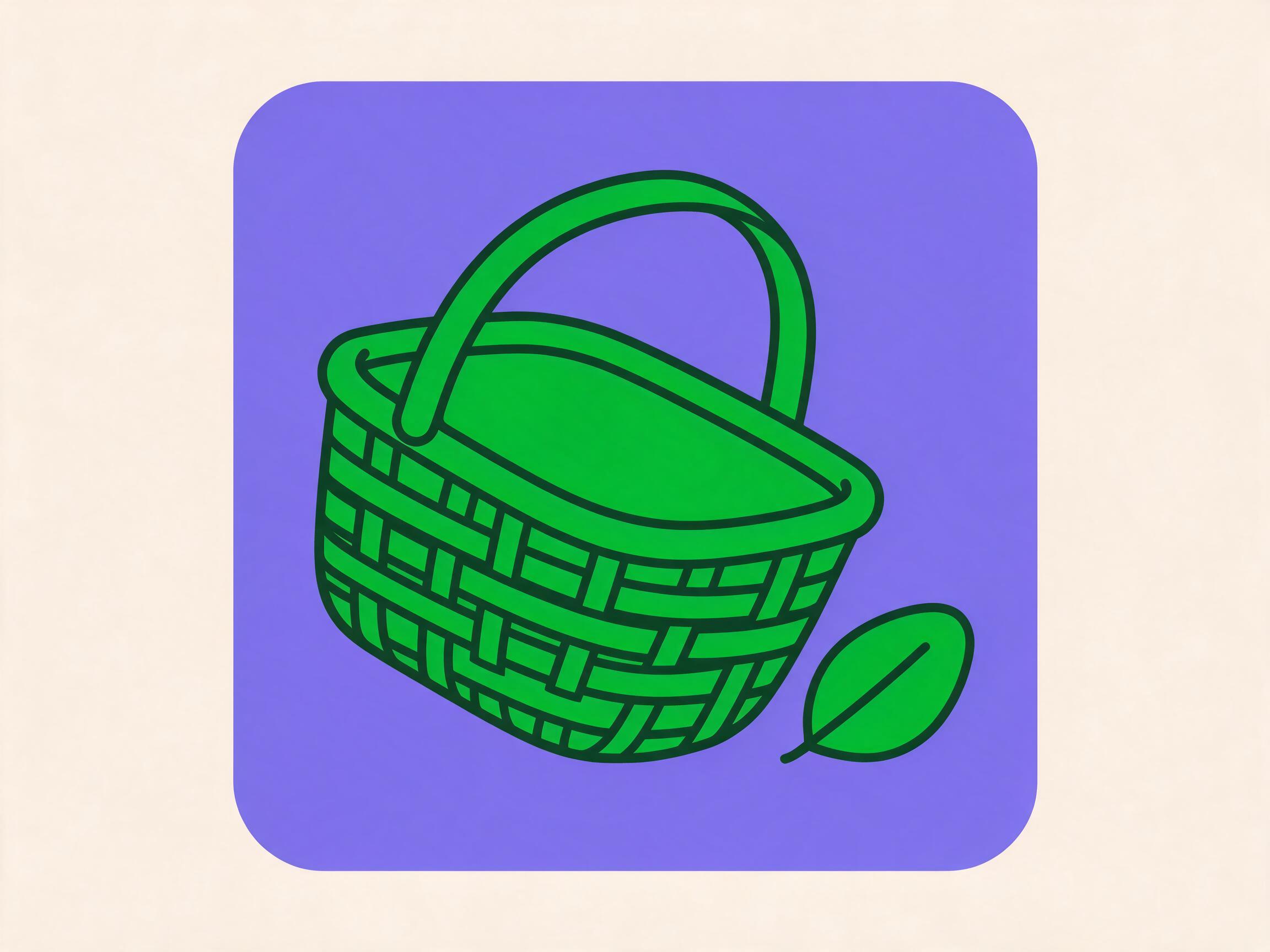
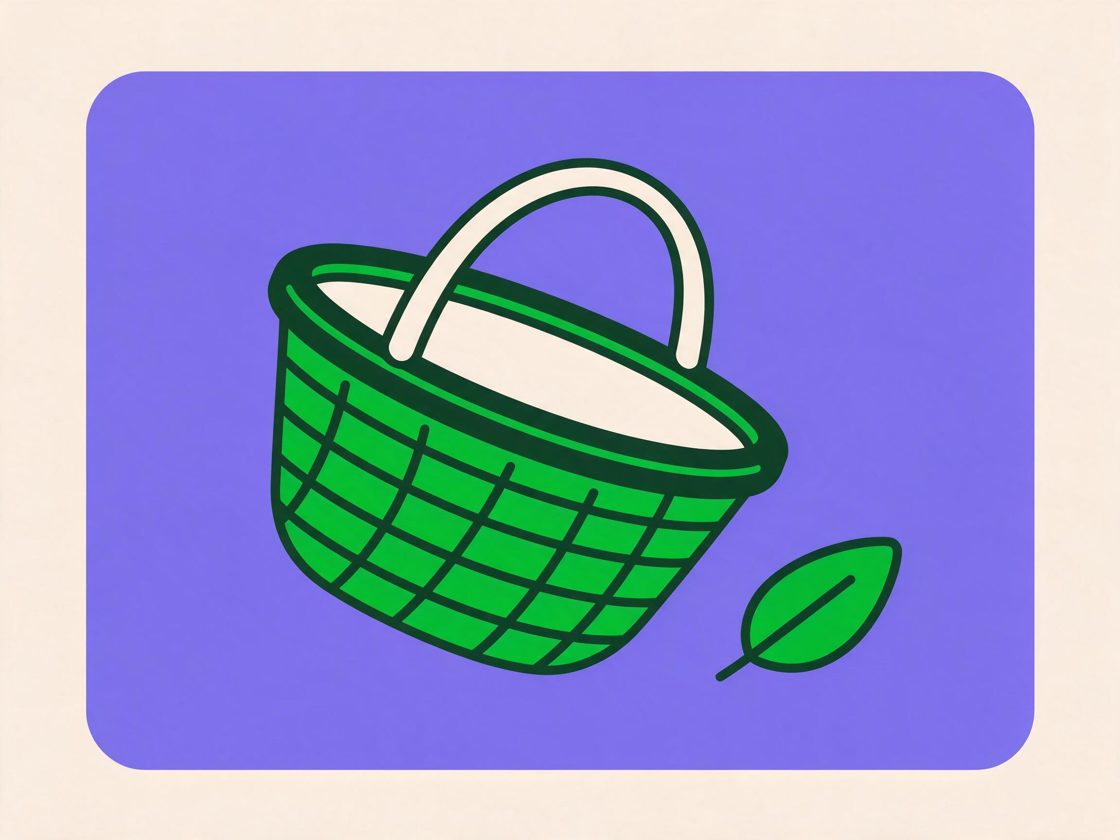
Tier B · periwinkle panel 200px · 4:3 tone=product

Your cart is empty

Add a few things and we’ll have them to you in 11 minutes.

Alternate take, not shipped. Both are on-palette; the chosen one keeps the basket weave reading as weave at 200px. Neither is tipped on its side as the subject line asks — an upright empty basket still reads as empty, so it shipped.

An empty cart is not a failure, so nothing here apologises for it. “Sorry, your cart is empty” apologises for the customer’s own behaviour. The body carries the reason to act — 11 minutes — rather than a reassurance, and the button is product because browsing the catalogue is the repeated action, not the money path. Commerce is reserved for the one CTA per screen the customer cannot undo, and this screen has none.
No orders yet
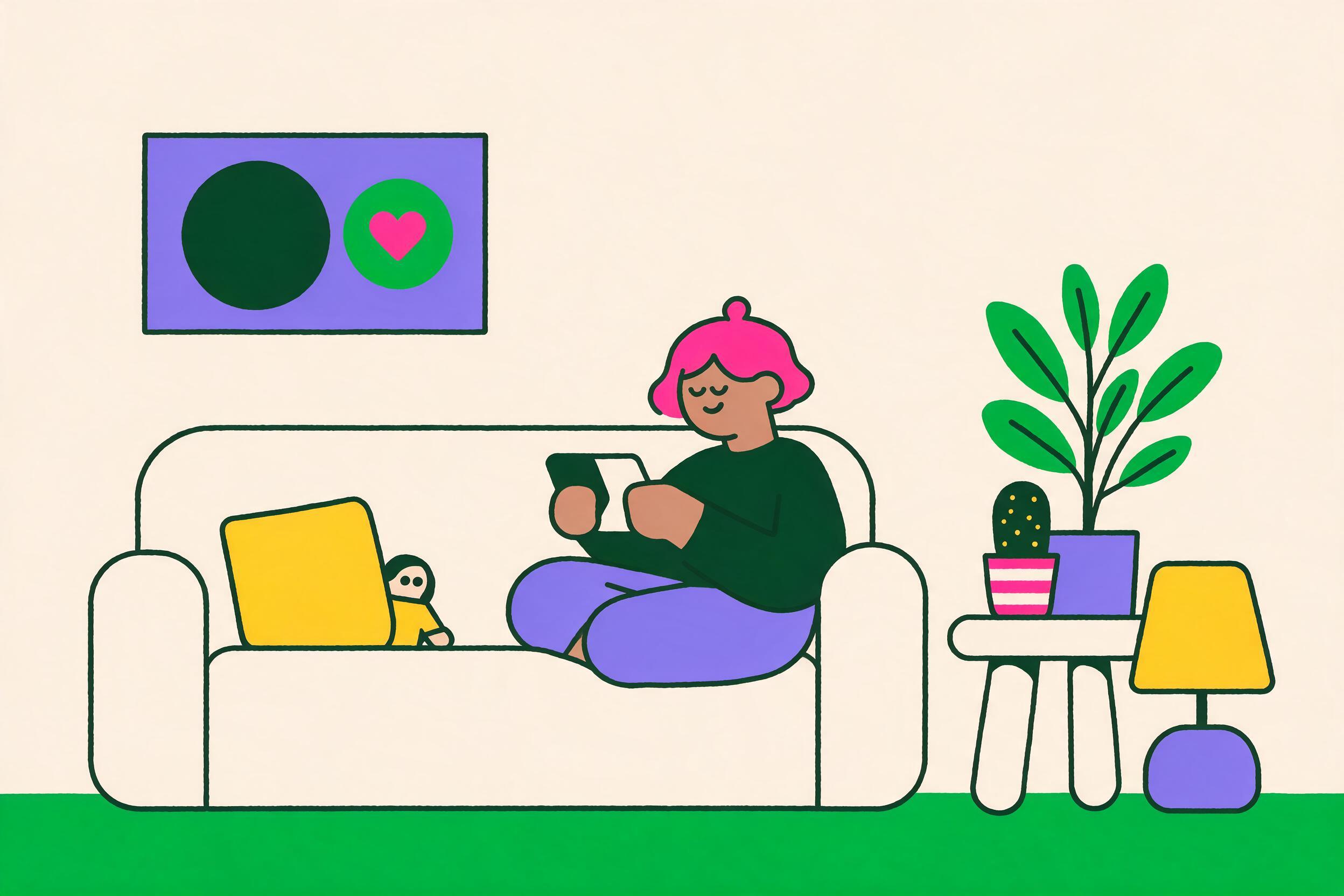
Tier C scene · no panel, green ground line 400px · 3:2 tone=product

No orders yet

Most first deliveries arrive within 30 minutes of checkout.

Tier C is the only tier that earns 400px, and the only one with people in it. A scene is for a first-run moment where the product is asking for trust it has not yet earned; it is far too much furniture for a routine empty list. This screen qualifies because it is genuinely the customer’s first visit to the orders tab. The second time they see an empty list — after cancelling their only order — is not a first-run moment and gets a Tier B spot, or nothing at all.
Scenes are where representation is a system decision, not a per-image one. Skin tones are drawn from the natural range and vary across the set; faces stay minimal — a curved line for an eye, a small mouth, no nose shading — so a scene reads as a person without becoming a portrait of one particular person. Three accents here: pink, periwinkle, yellow, inside the limit of four.

Alternate take, not shipped.

“Within 30 minutes” is the specific that replaces a reassurance. “You’ll love your first order” is a promise no one can keep or check; a number is one the customer can plan around and hold the product to. Warm is fine here because nothing has gone wrong — an empty orders list on day one is the expected state.
No search results
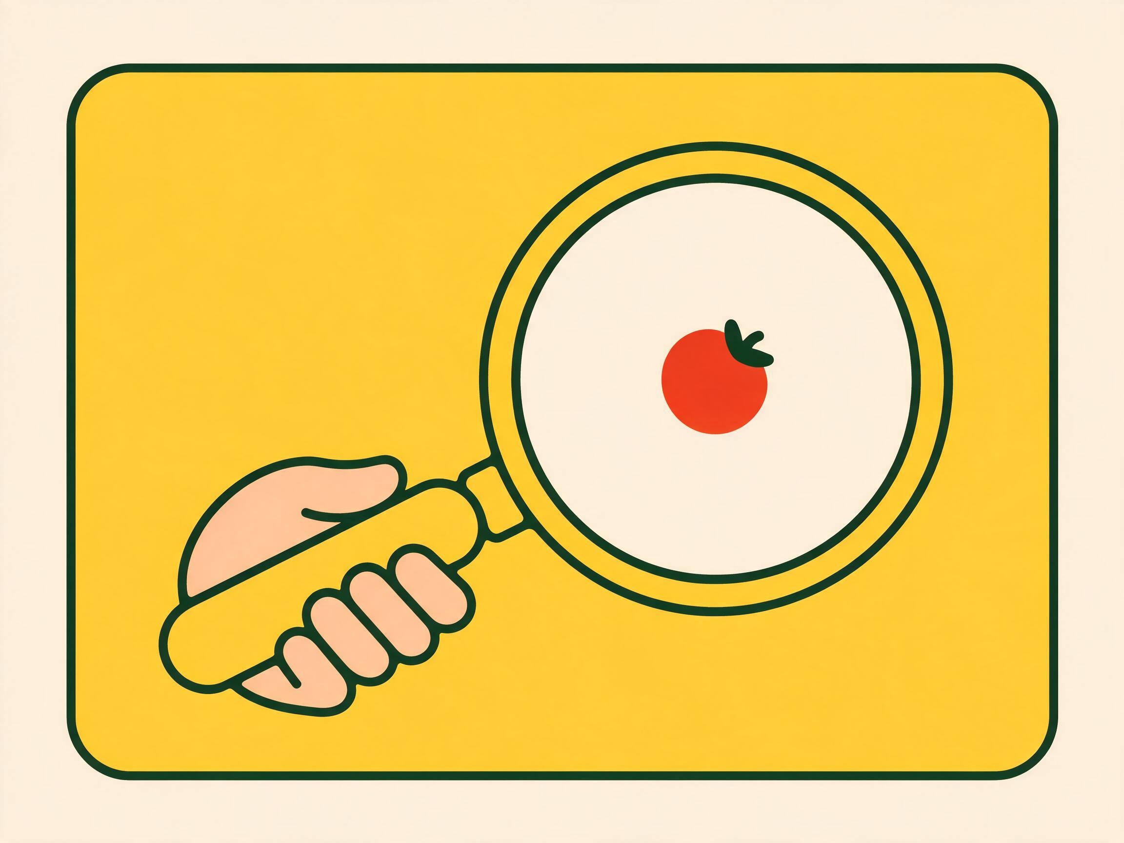
Tier B · yellow panel 200px · 4:3 tone=utility

No results for “aubergene”

Try “aubergine”, or browse Produce.

Alternate take, not shipped.

The heading quotes what the customer typed, misspelling and all, and the body offers the correction without naming the mistake. Not “you entered an invalid search” — the field is wrong, never the person. Yellow is a fill here and nothing more: it is 1.33:1 on white, so it carries the illustration panel inside the art and never renders text, an icon, a border or a focus ring anywhere in the UI around it. Search is not about buying food, so the button is utility.
Known defect: the tomato is green. The subject line asks for a tomato and the model filled it with #00B733, so the one object the lens is meant to identify is the one thing in the frame that cannot be identified. The palette already has #E8452F for exactly this. The hand the subject line calls for is missing too, which costs the spot its scale cue. Both ship only because the image is decorative and the heading carries the meaning.
Area not serviceable
Tier B · lilac panel 200px · 4:3 tone=utility

We don’t deliver to 94110 yet

We’re adding new ZIP codes every month. We’ll email you the day 94110 is one of them.

Alternate take, not shipped.

Own it once, name the ZIP code, then say exactly what happens next. “Yet” is the whole apology and it does the job in three letters. The button says what happens rather than what the customer presses — Notify me hides both the channel and the trigger, which is how a person ends up surprised by an SMS. This is a coverage boundary, not an error, so the state keeps its lilac panel and its full accent colour.
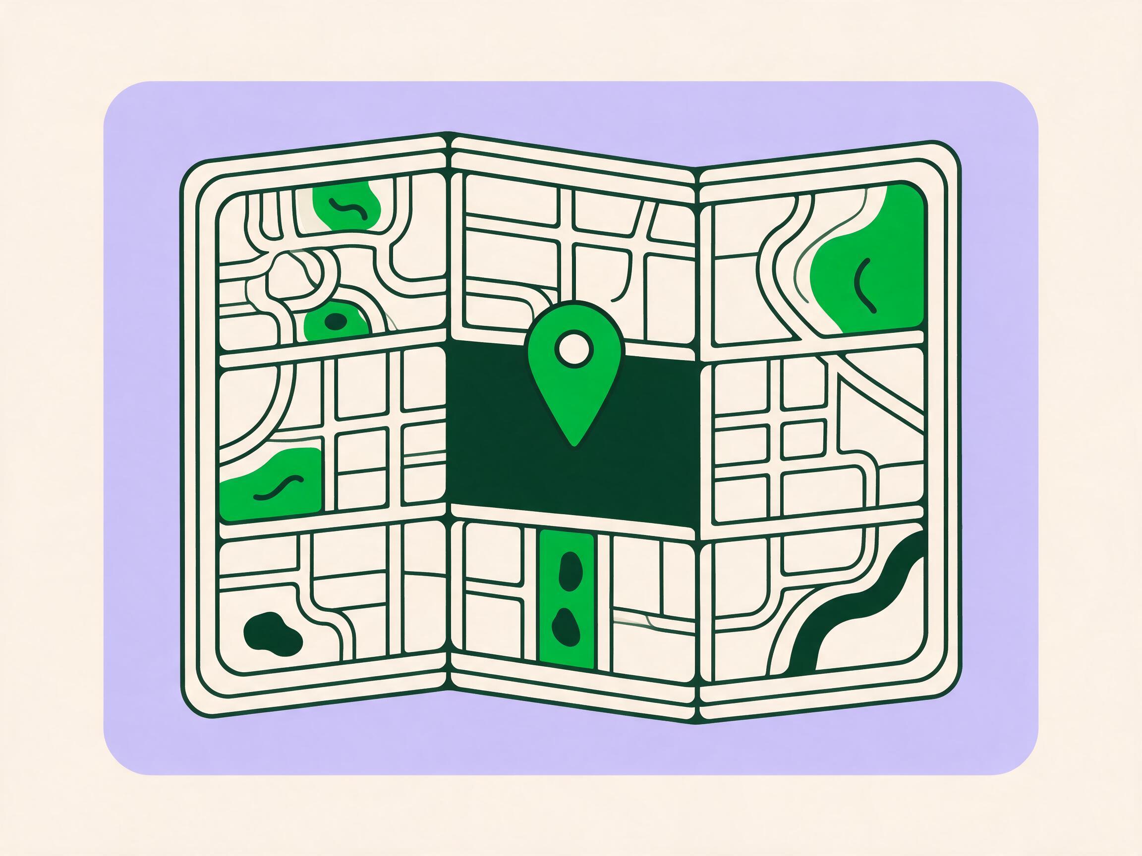
Known defect: this one has shading. There is a tonal step under the pin and under the stacked map sheets — soft ambient occlusion, which the palette rules forbid outright alongside gradients, drop shadows and texture. The map is also fully drawn with roads and parks, where the subject line asks for the pin to stand “in the middle of a blank area”; the blankness was the whole point, because the empty patch is the picture of not being covered yet. Regenerate before this one is reused anywhere larger than 200px, where the shading becomes obvious.
Payment declined
Tier B · no panel colour · outline only, muted 200px · 4:3 tone=commerce

Your bank declined the payment

Try another card, or use Apple Pay. Nothing was charged.

Alternate take, not shipped.

This is the quietest panel of the five, and every difference is deliberate. No colour panel behind the subject, so it is the only one whose art is the same cream as its ground. No props, no motion lines, nothing celebratory. No btn-shine, no celebrate, and this fragment declares no keyframes at all, so there is nothing on this panel that could animate. All that survives is the standard 90ms motion.feedback press on the button, which is acknowledgement rather than celebration — the same reason a declined-payment sheet is still allowed to slide in. This is one rule with two faces: the ban on celebrate-motion after a decline, and the ban on a cheerful illustration above one. An apologetic, bouncing, brightly panelled drawing on a failed payment reads as mockery.
Three things, in order: what happened, why, what to do. The heading carries the first two and names the bank as the actor, because “Payment failed” leaves the customer wondering whether we lost their money. “Nothing was charged” answers the question they are already asking. No apology loop, no error code, no exclamation mark anywhere near money. commerce is correct here even though the tone is sombre: tone names the path, not the mood, and this is still the money path.
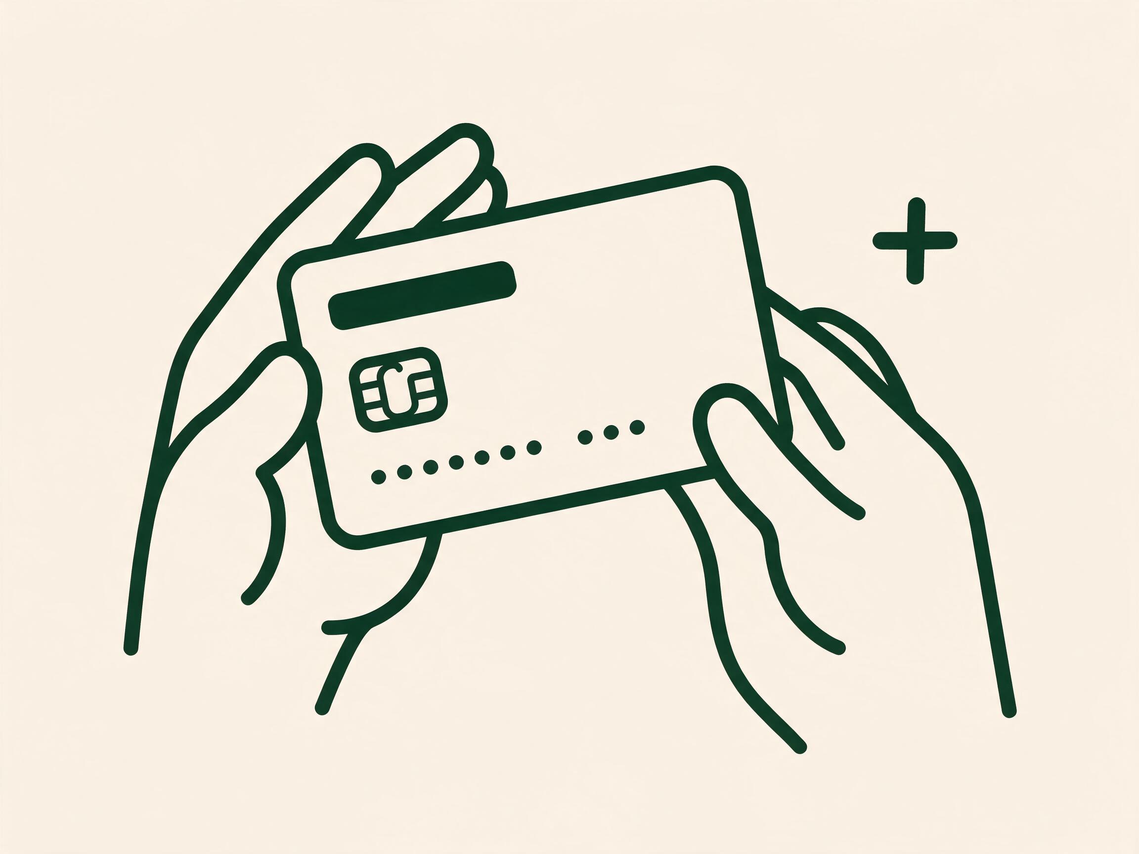
Known defect in the generated art: it renders a PLUS, not a cross. The subject line asks for “a small simple cross mark beside it” and Seedream returned a +. A plus beside a bank card reads as add a card — which is close enough to the actual next action to be genuinely misleading, and the exact opposite of a decline. It ships only because the mark is decorative and the heading carries the meaning, which is the a11y rule doing real work rather than paperwork. Regenerate with “a small ink X, two crossed strokes at 45 degrees”, or crop the mark out.

Composed pages

Catalogue
$15 off produce over $50. Applied at checkout, ends Sunday.

Buy it again

From your order on August 19

28% OFF
11 min

Roma Tomatoes, Vine-Ripened

1 lb
$3.49
$4.29
2
Back Thursday

Boneless Skinless Chicken Thighs

2.5 lb · Family pack
$9.87
11 min

Organic Whole Milk

1 gal · Horizon
$5.99
1
2 FOR $7
11 min

Blueberries, Driscoll's

6 oz
$3.99
11 min

Pasture-Raised Large Eggs, Grade A

12 ct · Vital Farms
$7.29
1
11 min

Sourdough Boule, Fresh Baked

24 oz · 6 per order
$6.49
1
11 min

Hass Avocados, Ripe

4 ct
$4.99
1
11 min

Sharp Cheddar, Block

8 oz · Tillamook
$2.44
1
what this screen is carrying
Address, search, offer, seven category chips, eight tiles and a Checkout bar — on 390px. Every one of those was signed off in isolation; this is the first place they compete for the same 390 pixels.
The steppers and the ADD are live. Change a quantity and the Checkout bar re-totals, which is the only way to see that the bar has to hold a number that grows to two more characters.
Chicken Thighs is out of stock: the tile keeps its price, dims nothing it does not have to, and disables ADD rather than disappearing from a list the shopper is scanning for it.
Cart
Your cart 7 items · Marisol shops at 5:40 PM
Roma Tomatoes, Vine-Ripened 1 lb · $4.29 $3.49 each
$6.98
2
Organic Whole Milk 1 gal · Horizon
$5.99
1
Hass Avocados, Ripe 4 ct
$4.99
1
Sourdough Boule, Fresh Baked 24 oz · 6 per order
$6.49
1
Pasture-Raised Large Eggs, Grade A 12 ct · Vital Farms
$7.29
1
Sharp Cheddar, Block 8 oz · Tillamook
$2.44
1

If something is out of stock

Marisol will follow this for every item in the order.

One code per order.
Subtotal$34.18
Delivery · 11 min$3.99
Tip for Marisol $5.00
Total$43.17

Card ending 4417 is charged when the order is delivered.

what this screen is carrying
Six line items, three substitution options, a promo field and a five-row summary. Type FRESH10 and press Apply — a discount row appears and every total on the screen moves, including the one inside the CTA.
Any other code is a plain refusal in field.error, with no exclamation mark and no blame: the code is not recognised, and the field keeps what was typed so it can be corrected.
Place order is the only commerce button on the screen. Apply is outline, the steppers are product. Two dark-green buttons here would make the shopper choose which one takes the money.
Order Tracking
Order #4182 Placed 6:02 PM · 7 items
Arriving
by 6:42 PM
About 24 minutes away
Order placed 6:02 PM
Marisol is shopping 5 of 7 items picked
On the way Expected 6:25 PM
Delivered to your door Expected by 6:42 PM
Marisol R. 4.9 · 1,240 orders shopped

Your order

7 items · $43.17

Roma Tomatoes, Vine-Ripened2
Organic Whole Milk1
Hass Avocados, Ripe1
Sourdough Boule, Fresh Baked1
Pasture-Raised Large Eggs, Grade A1
Sharp Cheddar, Block1
what this screen is carrying
A four-step Stepper, a shopper card, an ETA, a six-row order summary and a destructive action — and no commerce CTA at all. The money path is finished; putting a dark-green button here would invent a decision the shopper does not have.
Press Cancel order. The outline-danger button opens a confirmation that states what is lost and what is returned, before anything happens. The confirm is solid danger, the escape is ghost, and the escape is listed last so a thumb resting at the bottom of a 390px screen does not land on the destructive one.
No celebration motion on the confirm. motion.celebrate is restricted to add-to-cart, order-placed and first-run. The cancelled state arrives with no animation and no exclamation mark.
What three composed screens prove that isolated panels cannot
Slot collisions. The sticky Checkout bar covers the bottom 40px of the tile grid, so the last product row needs clearance the tile itself knows nothing about. The sticky search header and the offer strip both want to be the first thing seen. And the stepper is 24px wider than the ADD it replaces — inside a 171px tile foot, that is the difference between a price sitting beside the control and a price wrapping under it. None of those three are visible in a panel that holds one component.
Density. Eight tiles, seven chips, an address, a search field, an offer and a CTA on 390px is the real budget. Components that each looked generously spaced at panel size are shoulder to shoulder here, and this is the only place to find out whether space.4 between tiles is still enough when there are eight of them rather than two.
Real content lengths. "Boneless Skinless Chicken Thighs" and "Pasture-Raised Large Eggs, Grade A" both wrap to two lines in a 171px column, which is why .tile-name clamps at two and why the foot is pinned with margin-top:auto — a one-line name and a two-line name have to leave their prices on the same baseline. A panel full of "Milk" would never have shown that.
Exactly one commerce CTA per screen. Catalogue has Checkout, Cart has Place order, Tracking has none. Everything else on all three screens is product (the steppers and ADD), utility (Message Marisol), outline (Apply) or danger (Cancel order). Counting the dark-green buttons on a finished screen takes a second; counting them across thirty component panels is not possible at all.